Inbound marketing is becoming widespread across the industries and e-commerce is no exception. As HubSpot puts it, “Inbound marketing is about creating valuable experiences that have a positive impact on people and your business through relevant and helpful content”.
Being part of inbound marketing, content is one of the key factors of forming the brand image and users’ perceptions. Content helps communicate the brand’s message to the clients and helps the shoppers make decisions about the purchase based on the product descriptions.
While e-commerce relies on visual elements heavily, content is the exact tool to highlight the product value and convince the user to buy. Use these tips for fixing the content on your e-commerce store and enjoy the increase in conversions!
1. CTA Button Content
Call-to-action (CTA) buttons are your little helpers in pushing the shopper towards the desired action. If played right, they do provide amazing results.
CTAs can be placed basically anywhere: on the homepage, product pages, check out. These buttons and their content are based on the set goals: sign-up, conversions, sales, follow on social media.
We are used to seeing “Learn more” or “Buy now” CTAs – but in its “UX Playbook for Retail” Google recommends to refrain from such clichés and instead, customize the CTA content in accordance with your product. You can check out the main takeaways from the e-commerce playbook in this article.
Customized CTAs serve as reminders about the products and are more personalized. For example, your homepage CTA can state “View all glasses” or “Find your perfect fragrance”.
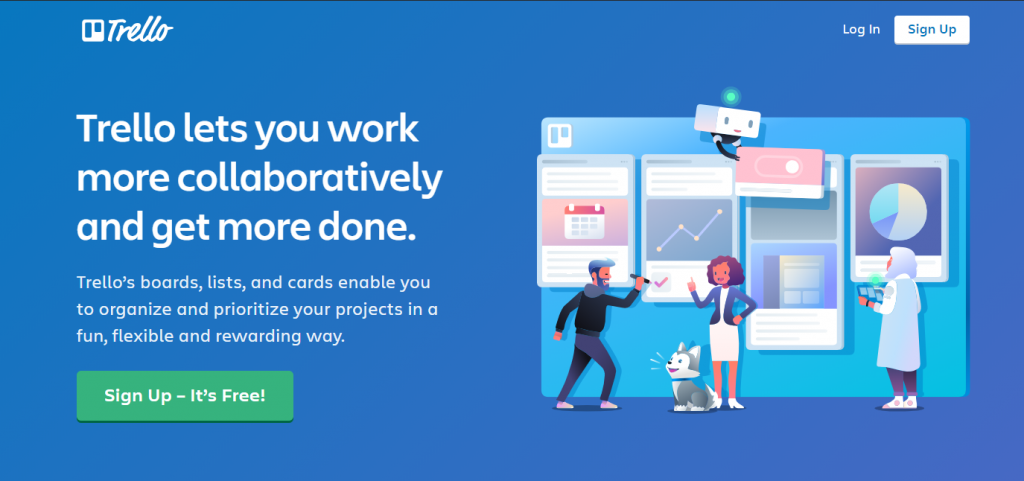
One more thing about CTA content: add value. Let your CTA button be benefit-oriented. Instead of “Buy now” you can say “Buy now & Get a discount”. Such call-to-action sounds more appealing than a boring cliché.

Source: Trello
Bonus tip: the higher you place your CTA button, the better response it normally causes.
As well, make it visible and eye-catching. It is recommended to restrain from using ghost buttons as your CTAs as they don’t drive as much attention as CTAs in bright colors. However, do the A/B testing to see what CTA performs the best for your site specifically.
2. Product Description Content
This one is big. Product description basically tells the shoppers what your product or service is about, what value it has, and why the shopper should choose it.

Source: Bvlgari
The example above is a good one in terms of content. The first piece of content that shoppers see is clear and straight to the point description of a piece of jewelry. Below is a more detailed one that contributes to the formation of a brand’s image.
Here are some life-saving tips on refining your product description content:
- Rewrite the description provided by the manufacturer
This advice is more SEO-oriented yet quite important. When a manufacturer sends their goods to the retailer, they normally provide a product description. Many retailers copy-paste it to the site and this harms the store ranking.
Since your store may not be the only one selling this item, imagine that all your competitors use the same content. In this case, Google will simply rank huge stores that already have a high ranking and it will ignore your store in favor of the others.
- Include keywords
Think about the shoppers. In order to find a certain product, they use keywords to narrow the search down and receive accurate results. Thus, do some research, see what keywords have high search volume, and include them in the product description.
Important: do not over-do the whole keywords thing. Your content should look natural, not like a low SEO effort.
- Keep it simple yet informative
Users don’t have time to read lengthy copies about the benefits of your product over the competition. Provide them with clear points that describe the product and its value.
3. Value Proposition Content
The major thing to remember about value proposition is that it should be included in every page of an e-commerce store.
A value proposition is a page element that informs the users about the value they will get from completing an action. However, a value prop has to be informative, clear, and original so the user completes the conversion.

Source: NYX
A value proposition is normally placed above the fold in order to always remain visible for the shoppers. The major features of a good value prop are:
- Concise
- Focus on benefit
- Keep the hype low
Examples of value propositions are “Sign up & Get 20% off” or “Free delivery worldwide”. Think carefully about what you are ready to give to the shoppers and describe it in an engaging manner.
4. Personalized Content
By personalization we mean the personalized suggestions and recommendations that the shopper sees on the store website. They are used as upselling and cross-selling strategies that help the user pay attention to relevant or more expensive products.
Enough has been said on the importance of personalization in the world of e-commerce. Numerous reports state that customers who see personalized recommendations respond to them more positively and convert more. Personalized suggestions drive 26% of the total revenue and 36% of the shoppers are interested in buying personalized products, as per Deloitte.
There is one tricky pitfall that you should know about when creating content for “Recommendations” section. Customers hate to be imposed an opinion.
Compare the two phrases: “We think you would like that” and “A pick specially for you”. Both have the same meaning but the way of putting it differs drastically. The first option shows that you decided what may be the best for the customer, while the second one shows how carefully crafted this suggestion is.
Bonus tip: use the power of customer reviews and peer influence.

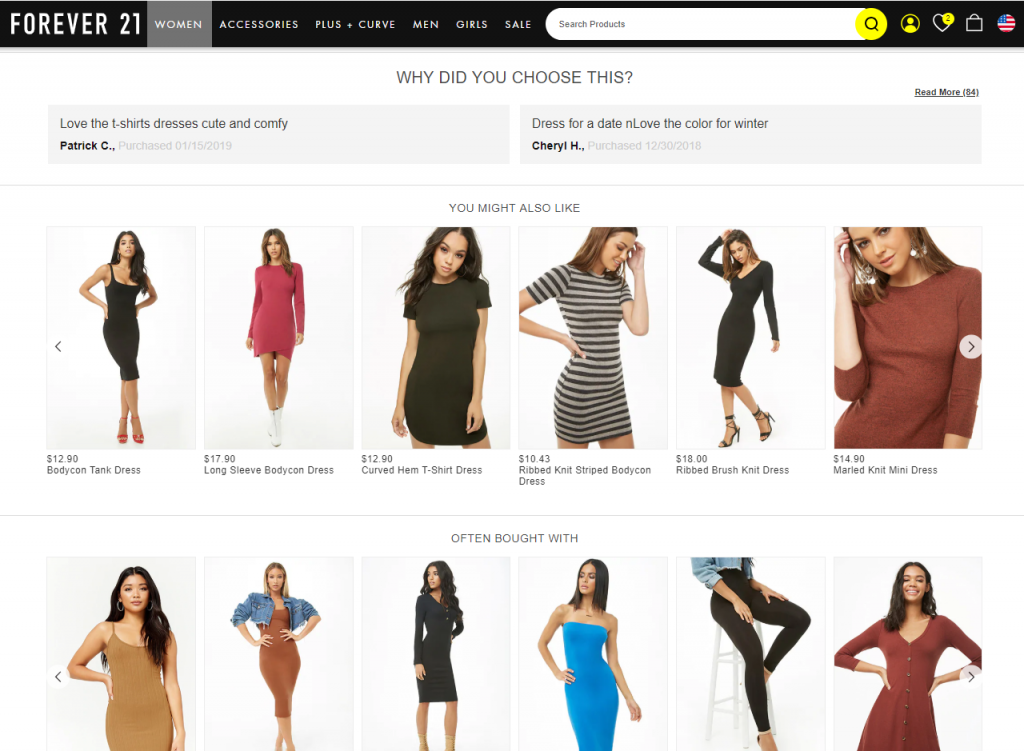
Source: Forever 21
Another strategy to be used in the recommendations section: write what other customers think of a product. Considering the fact that 72% of the shoppers don’t act unless they read a review and 84% of shoppers trust reviews as much as they trust a personal recommendation, reviews are a power to reckon with.
When you write “A pick just for you”, you are addressing a shopper directly. When you say “Other customers loved that”, you are giving an option of checking out the reviews and (again!) making own opinion, based on the feedback from the peers.
5. Checkout Content
The trickiest part of the e-commerce sales funnel is seamlessly leading the shopper to the purchase completion. And well-crafted content can either make it or break it.
One of the UX strategies for making the checkout process easier and faster is the implementation of a progress bar on the checkout page. By seeing the progress, the shopper will be more motivated to complete all the steps. Here is where content helps.

Source: Vandelay Design
Instead of writing “You have completed 0 out of 5 steps” try “Time for step 1 out of 5!”. People don’t perceive negativity well but will be glad to start, once presented with an option.
And don’t forget about informative CTAs and value props but don’t be too pushy.
General Recommendations on Crafting a Stellar and Selling Content
Though seemingly simple, the creation of a catchy and selling content is more difficult than many e-commerce store owners think. Below you will find the general guidelines on how to write a compelling copy that engages the shopper and leads to conversions.
I. Define your tone
First, think about how you would like your brand to be perceived by the users. This will dictate the tone and style of your content.
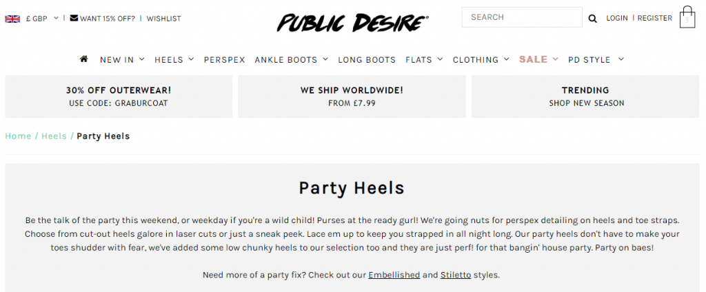
Public Desire store is a good example.

The brand positions itself as being a “girlfriend” for the shoppers and uses the corresponding slang to appeal to its target audience.
Thus, you need to:
- Define a target audience
- Define your tone and image
- Address the shoppers correspondingly
A good idea would be to perform A/B testing to see what kind of message causes better responses.
II. Think customer-centric
When creating any content, think about your shoppers first. What they may want to learn and what kind of information they may need?
Many e-commerce giants adopted the practice of providing additional information to the users. It can be in a form of FAQs or separate sections, like “Delivery” or “Size charts”. Such pieces of information serve as a valuable add-on and help the user make a purchasing decision.
III. Don’t forget about blogging
Companies with blogs, in general, have 434% more indexed pages – how well does it sound?
Moreover, blogs help brands share their opinion and views, interact with the users, and keep them updated on anything important.
When posting to the blog, try and keep the posts consistent and relevant to the overall website style. Use hashtags and different topics for easier navigation. As well, enable comments and options to share the blog post in the social networks.
IV. Make it SEO-friendly
A SEO-optimized copy can lead conversions and help you sell more by driving organic traffic to your store.
You can do the following to your site’s content:
- Add relevant keywords to product descriptions, URLs, metadata, image descriptions. Keywords help your e-commerce site rank higher and increase its visibility for both the users and search engines. When placing keywords, keep an eye on their density because your content should look organic.
- Avoid duplicate content. The more unique content you have on your site, the better it is.
- Keep it mobile-friendly. The majority of users prefer to browse the stores and shop by using their mobile devices. Thus, make sure the content looks equally good on both mobile and desktop versions.
Summary
The basic thing to remember for any e-commerce marketer is: content and visual elements should complement each other and are equally important.
Marketers often make a mistake of pushing the design upfront and then writing the corresponding copy. However, it is recommended to first write your copy and then, based on it, build your visual elements.]]>